Quiet Opulence: Materials That Endure

Today we explore Timeless Material Palettes for Understated Luxury Interiors, focusing on how stone, wood, metals, textiles, and light harmonize into lasting calm. Expect tactile nuance, honest finishes, and enduring craftsmanship that rewards daily use. Share the materials you live with, subscribe for future insights, and tell us which surfaces age most beautifully in your home—your experiences shape our next deep dives and help refine a collective language of softness, restraint, and quiet confidence.

Selecting Authentic Stone

Honed or brushed limestone, soapstone, and marble each offer distinct character; the secret lies in choosing a finish that softens reflections and amplifies texture. Consider density, absorption, and edge profiles that welcome wear rather than resist it. A low-sheen surface hides daily scuffs, while precise chamfers feel handmade. Tell us if your kitchen marble carries etches with pride—your story helps others embrace the soul that mineral history brings to everyday rituals.

Rift-Sawn and Quartered Oak with Quiet Confidence

Rift-sawn and quartered cuts tame movement while drawing delicate lines that guide the eye. Specify natural oil finishes to highlight tannin depth and allow repairable maintenance. Grain orientation matters near windows and thresholds, where light rakes across boards. For cabinetry, restrained profiles with minimal reveals keep attention on tone and texture. Do you live with barefoot-friendly oak? Comment on comfort, color shift over time, and which oils minimized ambering without dulling the wood’s elegant clarity.

Mineral Walls with Limewash Depth

Limewash and true mineral plasters absorb light, creating clouds of tone that feel soft from every angle. Unlike synthetic coatings, they layer translucency, breathability, and gentle color drift that calms busy rooms. Sample across corners to assess shadow play, and test against stone or oak to harmonize undertones. Readers often report improved acoustics and a more restful atmosphere. We invite your before-and-after images to show how mineral walls transform echo into intimacy with remarkable, quiet permanence.

Neutral Color Through Material, Not Paint

Understated interiors rely on neutrals built from fibers, minerals, and metals rather than pigment alone. When color arrives through material, it cannot peel or date quickly; it deepens. Map undertones—warm stone alongside cool linen can feel unsettling. Use a traveling board to test combinations in different rooms and daylight conditions. Share which undertone charts worked for you, and we will publish a reader-crafted guide to pairing cool-veined stones with mellow woods without losing serenity.

Undertone Mapping for Seamless Continuity

Every neutral hides an undertone—pinkish limestone, greenish-gray marble, honeyed oak, taupe linen. Lay samples together and squint to perceive temperature shifts. Photograph at morning, noon, and evening to document drift. A neutral palette should flow through thresholds without jolts, letting furnishings rotate over years. Tell us your most surprising clash and the adjustment that fixed it; your discoveries help others avoid costly repaints and achieve effortless continuity that feels calm from entry to bedroom.

Color by Reflection: Floors, Fabrics, and Light

A pale floor can bounce cooler light onto walls, subtly bleaching warm tones. Dense wool rugs absorb glare, warming the overall perception without adding saturation. Sheer linen filters blue daylight into soft silver, while brass introduces cozy highlights. Experiment with reflective indices by placing mirrored trays or matte ceramic next to fabrics to observe shifts. Share your quick tests and we’ll feature resourceful tricks for reading color in real rooms, not under showroom lamps.

Texture That Whispers, Not Shouts

Tactility anchors memory; a room remembered by touch rarely needs loud pattern. Balance nubby linen against honed stone, soft wool against burnished metal, and smooth oak against mineral plaster. Establish a hierarchy: one pronounced texture, two supportive textures, and a calm field. Acoustics benefit when fibers absorb and hard surfaces speak gently. Share audio or impressions from your most comfortable room—did a single woven element change the mood? Your observations guide our tactile experiments ahead.

Matte, Eggshell, and Subtle Burnish in Concert

Gloss can feel glamorous, yet even a whisper of sheen risks glare. Combine matte plaster walls with eggshell cabinetry for quiet wipe-ability, then introduce selective burnish on a stair handrail where touch justifies sparkle. This orchestrated contrast defines edges without noise. Test different sheen levels under raking light to catch unwanted hotspots. Tell us where a tiny sheen shift clarified your space; a well-judged glimmer often replaces needless pattern while preserving calming restraint.

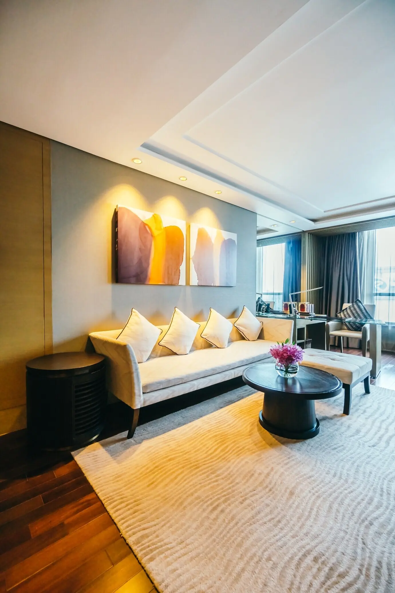
Weave Density and Pile Height for Comfort

Textiles carry the temperature of a room. A dense twill filters light more softly than an open weave, while a low, resilient wool pile soothes underfoot without swallowing detail. Avoid trends; search for hand, drape, and longevity. Rotate samples to see shadow gradients across fibers. Which weave transformed your living area from echoey to enveloping? Post your findings, including fabric specs, and we’ll build a shared library of textures that deliver comfort without visual clutter.

Grain Direction, Cuts, and Veining Flow

Subtle rhythm comes from aligning wood grain through sightlines and selecting stone slabs that feel related rather than identical. Quartered grain near joinery reads tailored; book-matched veining creates quiet continuity. Avoid busy mosaics where calm is the goal. Mock up with taped outlines to predict movement across thresholds. Have you ever reversed grain and felt the room settle instantly? Describe the change, and we’ll explore practical ways to choreograph texture as a gentle guiding current.

Metal Accents with Patina and Purpose

Metals should feel like punctuation, not megaphones. Aged brass warms cool stone, oil-rubbed bronze grounds pale woods, and hand-brushed nickel maintains calm in humid spaces. Select finishes that welcome fingerprints and mellow with touch; this intimacy signals authenticity. Limit the palette to one dominant metal and a supporting tone to avoid scattered reflections. Share how your hardware aged after a year—photos and notes help us compare sealers, waxes, and natural oxidation under everyday hands and light.

Finish Families That Belong Together

Cohesive metals share undertones and surface character. Pair aged brass taps with unlacquered knobs, using blackened steel for structural accents. Keep chrome away from warm ensembles unless its cool clarity serves a deliberate contrast. Assemble a tray of finishes and move it around the house, noting changes in north, east, south, and west light. Report your most forgiving combinations; we’ll chart reliable families that deliver richness while keeping reflections calm and wonderfully human.

Hardware Scaled to Human Touch

Understated luxury lives in tactile details: a lever that meets the palm just so, a drawer pull with softened arris, a cabinet knob that welcomes morning coffee hands. Test scale with cardboard cutouts and mark smudge zones to anticipate patina. Choose screws that match finish to avoid visual noise. Tell us which profile felt instantly right and why; ergonomic comfort, even in silence, becomes the daily joy that materials quietly promise yet never flaunt.

Light as a Material

Sun Paths and Orientation

Rooms facing east can feel pearly and cool by morning, while west-facing spaces glow amber at dusk. Choose materials that flatter their light: cooler stones for afternoon rooms, warmer woods where mornings dominate. Track reflections with simple phone time-lapses and place mirrors sparingly to guide brightness. Tell us which orientation challenged you most; we’ll propose tested rotations of textiles, sheers, and finishes that stabilize mood without resorting to heavy coloration or oversized fixtures.

Layered Illumination for Depth

Ambient, task, and accent layers support one another like instruments in a quiet ensemble. Linen-shaded lamps soften edges, concealed toe-kicks float cabinetry, and a single art light anchors the eye. Dim-to-warm technology prevents evening glare while maintaining intimacy. Craft two or three distinct scenes for everyday life. Share your wiring strategies and favorite switches, and we’ll compile a practical guide to layering that foregrounds texture, flatters materials, and respects the hush timeless interiors need.

Reflectance Values and Contrast

High reflectance surfaces spread light but risk visual fatigue; low reflectance enriches texture yet can swallow detail. Aim for a comfortable middle, mixing matte planes with small gleams at hand level. Use reflective samples beside fabrics to test how sheen influences perceived color. Report where you landed on balance—did a slightly darker rug calm a bright room? Your feedback helps refine a blueprint for contrast that preserves serenity while keeping navigational clarity at night.

Fabrics That Breathe Luxury Quietly

Natural fibers ground the material story. Linen lends dry texture and elegant wrinkles, wool tempers acoustics, and silk introduces delicate luster used sparingly. Prioritize performance-backed textiles in family spaces without sacrificing hand. Pre-wash samples, rub them, and test against pets or suitcase corners. We welcome your endurance reports—how did that mohair hold up after winter? Together, we’ll assemble a living catalog of textiles that feel generous, age beautifully, and never distract from architectural calm.
Double-width linen with a generous lead edge falls in deep, restful folds, filtering glare into breathable softness. Interlining adds body without glossy weight. Mount higher and wider than the opening to elongate proportion and control light spill. Share your favorite heading style and rod finish; real-world observations on dusting, shrinkage, and color shift help readers specify curtains that complement stone and plaster, completing the room’s hush while keeping views and ventilation respectfully considered.
Select dense wool or textured linen blends with thoughtful backing for seats, and consider removable covers in family rooms. A slight slub hides everyday impressions while preserving character. Test with a warm mug and a stray pen to foresee real hazards. Report your cleaning successes and cushion fills that stayed cloud-like without sagging. We’ll gather proven combinations of fabrics, stitch details, and welt choices that look tailored today and even better after a thousand evenings.
Understated spaces need foundation, not spectacle. Hand-knotted wool in heathered neutrals, flatweaves for circulation zones, or a subtle silk blend under a reading chair can anchor vignettes with tactility. Size generously so furniture breathes on the rug, yet edges remain legible. Share wear patterns from your busiest doorway and which pads kept corners dignified. Your lived experience informs a shortlist of reliable weaves that hold quiet rooms together with warmth, durability, and refined restraint.

Daily Habits That Protect Finishes

Place wool felt under trays, rotate cushions monthly, and introduce soft house shoes to preserve floors. Wipe spills quickly with mild soap, avoiding harsh chemicals that flatten sheen. Teach guests to love coasters without policing joy. What small rituals changed your maintenance life? Share them and we’ll create a reader-built checklist that keeps timeless materials glowing through seasons, protecting texture and color while allowing homes to be lived in wholeheartedly, not treated like museums.

Seasonal Tune-Ups and Renewal

Twice a year, re-oil oak, re-wax brass, and refresh grout with a careful brush. Inspect edges where water lingers and touch up burnished surfaces where hands naturally rest. Tiny interventions compound into decades of beauty. Tell us which products and techniques delivered results without unnatural shine, and where you sourced them. We’ll publish a calendar that aligns care with climate, ensuring materials evolve elegantly, celebrating memory rather than masking it under glossy, short-lived coatings.

Traceable Materials and Honoring Craft

Ask for quarry origins, forester certifications, and artisan names; provenance shapes integrity. Reclaimed beams with visible mortises may shift the narrative of a room from new to storied without feeling theatrical. Support workshops that train apprentices and document methods. Share your favorite makers and the details that moved you—a hand-planed edge, a dovetail you can feel. We will spotlight sources and practices that align quiet luxury with responsibility, longevity, and meaningful human connection.
Nikapizunuritenevotiva
Privacy Overview

This website uses cookies so that we can provide you with the best user experience possible. Cookie information is stored in your browser and performs functions such as recognising you when you return to our website and helping our team to understand which sections of the website you find most interesting and useful.